
The Meta-Analytic Rain Cloud (MARC) Plot: A New Approach to Visualizing Clearinghouse Data
Kaitlyn G. Fitzgerald & Elizabeth Tipton
What type of data do clearinghouses communicate?
As the body of scientific evidence about what works in education grows, so does the need to effectively communicate that evidence to policy-makers and practitioners. Clearinghouses, such as the What Works Clearinghouse (WWC), have emerged to facilitate the evidence-based decision-making process and have taken on the non-trivial task of distilling often complex research findings to non-researchers. Among other things, this involves reporting effect sizes, statistical uncertainty, and meta-analytic summaries. This information is often reported visually. However, existing visualizations often do not follow data visualization best practices or take the statistical cognition of the audience into consideration.
Cognitive pitfalls of existing visualizations
This article discusses primary critiques of existing visualizations and the cognitive pitfalls they are prone to; we highlight two here.
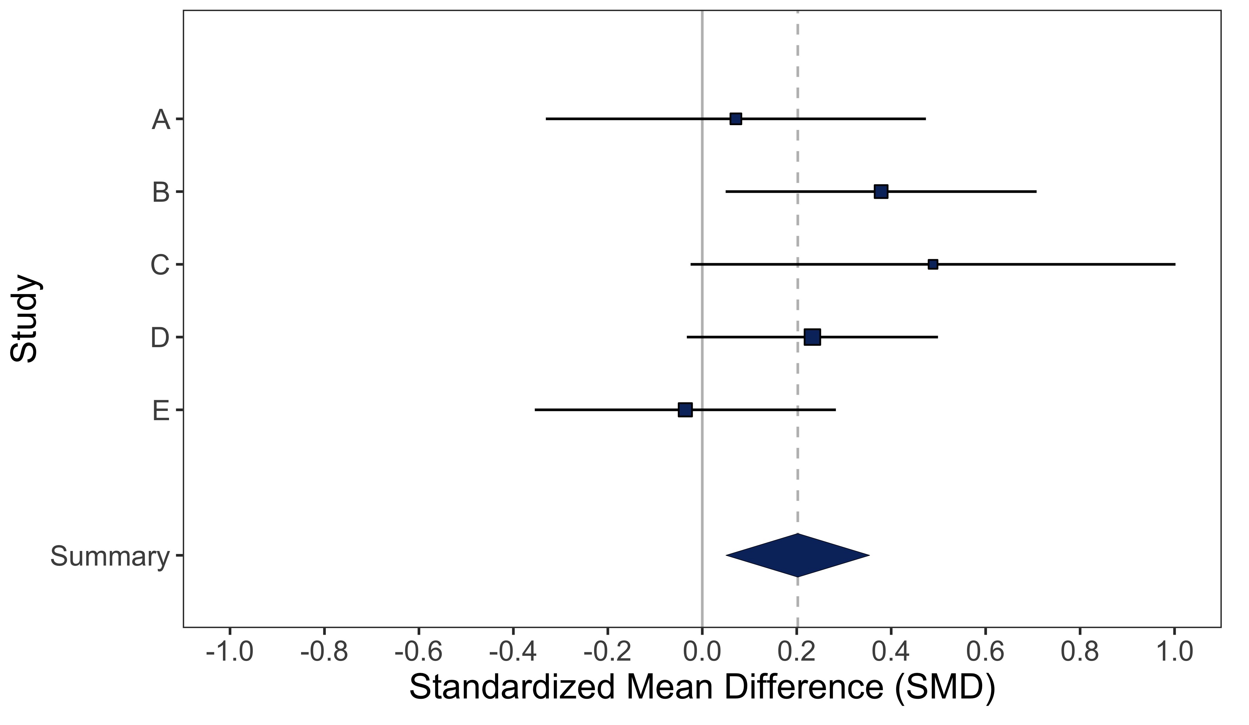
First, they tend to bring visual attention to the wrong things, in ways that are counter-productive to meta-analytic reasoning. For example, in a forest plot above, studies with the widest confidence intervals get the most visual attention.
Second, the y-axis is wasted. Data visualization literature consistently notes that our brains are fastest and most accurate at extracting visual information when it is encoded as position (e.g. on the x- or y-axis). However, in existing visualizations, studies are often sorted arbitrarily according to author last name, and the y-axis does not communicate information pertinent to meta-analytic reasoning about the evidence.
Meta-Analytic Rain Cloud (MARC) Plot
The MARC Plot was designed to address these cognitive pitfalls and others. Importantly, the y-axis is now utilized to display the weight each study receives in the meta-analytic summary, and annotations are added to guide the user’s interpretation of the evidence.
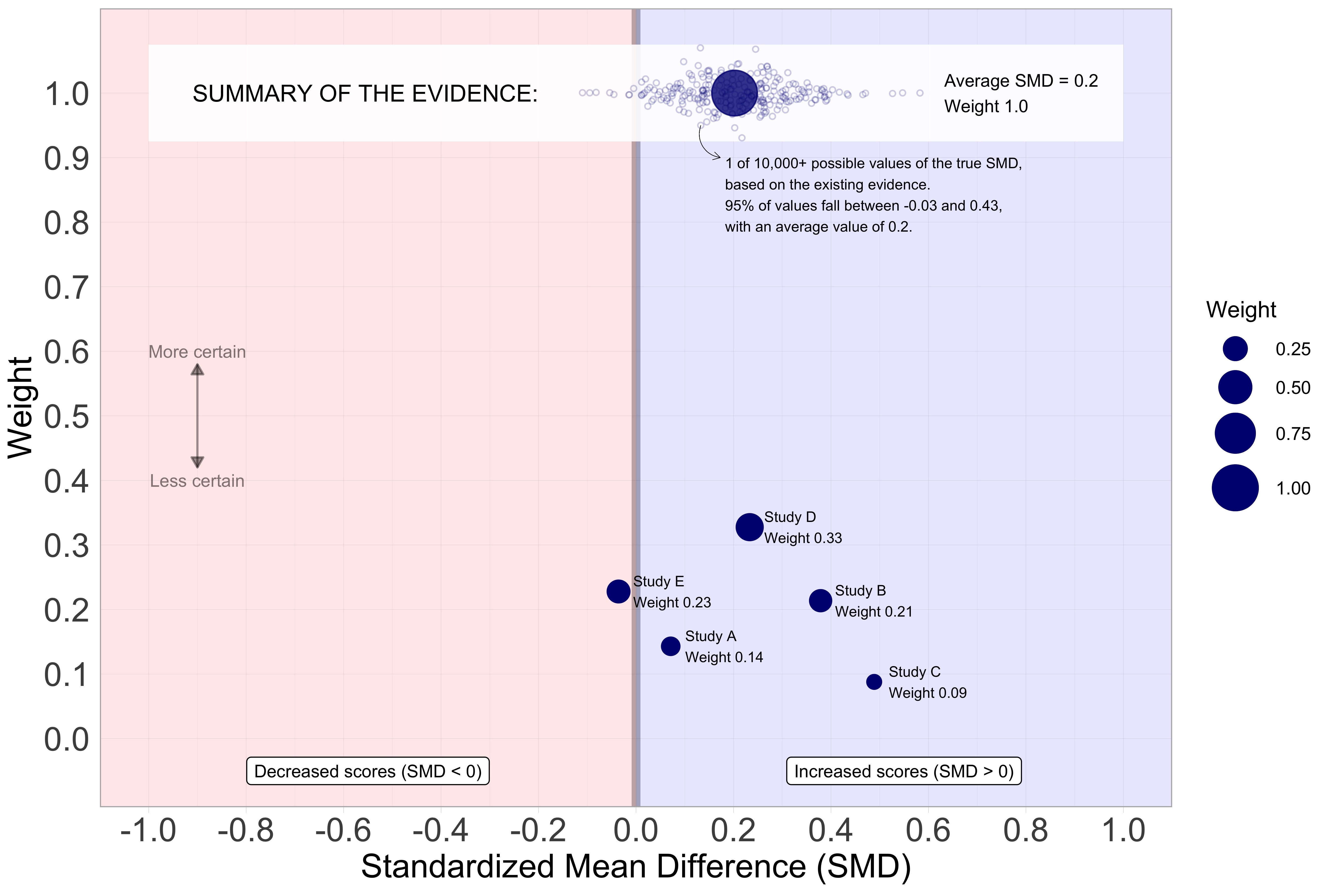
We evaluate the efficacy of this visualization in a statistical cognition experiment and find that compared to three other visualizations used in practice (including the forest plot), the MARC plot is more effective in helping participants correctly interpret evidence. We find that education practitioners in our sample have greater difficulty than researchers in correctly interpreting the evidence, but importantly, the MARC plot brings education practitioners’ understanding of the evidence up to a level comparable with education researchers in our sample. Our results serve as a reminder of the curse of expertise and that care should be taken not to assume consumers will interpret information the way we (researchers) intend.
Full Article Citation:
Fitzgerald, K.G. & Tipton, E. (2022).Meta-Analytic Rain Cloud (MARC) Plot: A New Approach to Visualizing Clearinghouse Data. Journal of Research on Educational Effectiveness. DOI: https://doi.org/10.1080/19345747.2022.2031366.